NBomber Studio 0.9.0
NBomber Studio 0.9.0 is out! This release adds a Logs tab that shows the logs of every node of your test. It also adds a Data Transfer chart, a metric table under every chart, and a new navigation for scenarios and steps.
New Logs tab
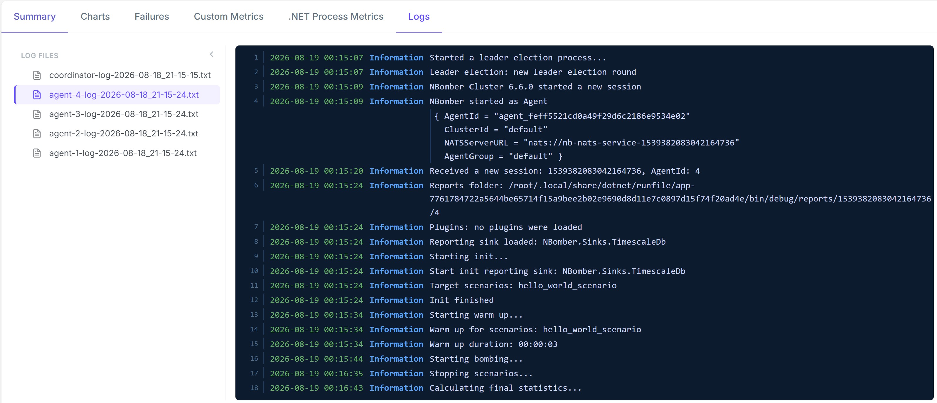
The Session Details view has a new Logs tab. Studio reads the logs of the session and shows them in the browser. You no longer download the artifacts archive and unpack it on your machine.
A console-style viewer. The selected file opens in a log console with line numbers, timestamps, and a color-coded level badge (Verbose, Debug, Information, Warning, Error, Fatal). A stack trace stays attached to the log entry that produced it. It does not break into separate unparsed lines.
Session Details: new navigation
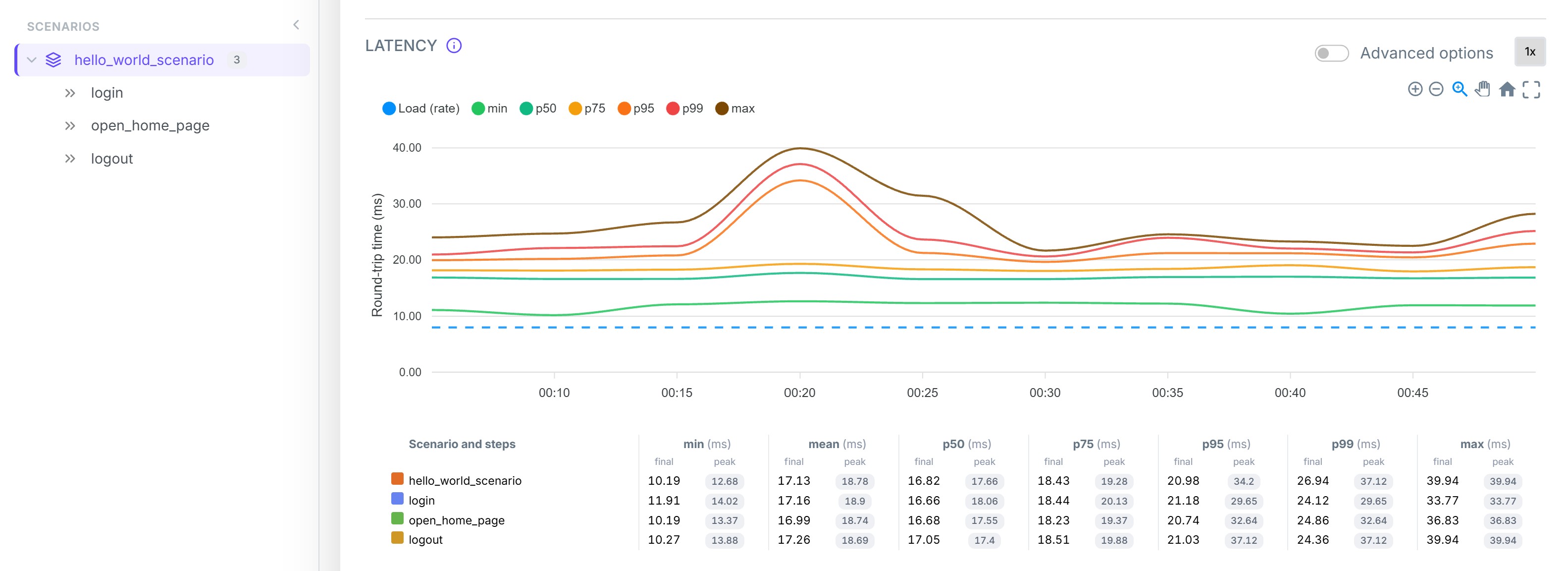
The biggest visual change is the navigation of the Session Details view. We replaced the old sidebar with a resizable tree of your scenarios and their steps.
- When you select a scenario or a step in the tree, the tabs show the data of this selection only. This applies to the Summary, Status codes, Charts, Failures, and Custom Metrics tabs.
- You can collapse the tree, or drag its border to change the width.
The Logs tab uses the same control for its list of log files. The navigation is therefore consistent across the whole view.
We also corrected two problems of the old layout. The page no longer jumps when you switch tabs, and the navbar stays visible.
New Data Transfer chart
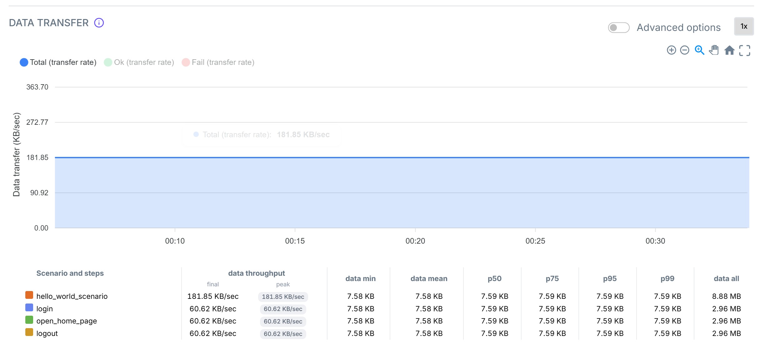
The Charts tab has a new Data Transfer chart. It shows the network throughput over time. The chart gives the amount of data per second for the successful (Ok) requests, the failed (Fail) requests, and all (Total) requests.
The data transfer metrics are also part of the Summary table now.
To see this chart, update NBomber.Sinks.Timescale to version 0.14.0.
A metric table under every chart

The Throughput, Latency, and Data Transfer charts each have a table below the chart. One row is one scenario or one step. Each row has a color mark that matches the line on the chart, so you can map the numbers to the lines. You do not need the legend.
Every metric has two values:
- final - the value for the whole run. For an active session, it is the most recent data point.
- peak - the highest value of the run.
Tooltips everywhere
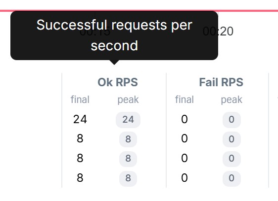
An info icon near each chart title explains what the chart shows. Each column header of a metric table explains its metric. The .NET process metrics have the same tooltips: CPU usage, memory working set, GC heap size, GC LOH size, time in GC, thread pool queue length, thread count, and DNS lookups.
Better chart scale
The charts now calculate the maximum of the Y axis from the peak value of the series. Before this change, a custom metric with large values made the main lines flat at the bottom of the chart.
📦 Docker image & Helm chart
NBomber Studio is available as a Docker image and a Helm chart:
- Docker Hub: nbomberdocker/nbomber-studio
- Helm chart: nbomber-studio (source)